Skip to content
blank

Who is AE2S? What do we stand for? Brand is more than just visual.

blank

A WORD FROM OUR CEO

The AE2S brand is more than just the molecule logo and our colors. Those are just the visual symbol of our passion, people, and commitment to serving our Clients and the communities in which we live and work. Our brand goes beyond marketing, it is our culture and our purpose. At AE2S, every single employee owner plays a role in what truly makes the AE2S brand. As a team, we lead by example and demonstrate exactly who and what we intend to be as company. Our brand reflects our people and the promise we make to each other and to our Clients. We want our brand to be instantly recognizable, spark positive emotion, and create an impression that speaks to who we are as a company. These guidelines will help ensure we consistently represent the AE2S brand to all the audiences we reach. We appreciate your respect and support in representing our brand in a way that reinforces the passion, people, and commitment to service that is AE2S.

Grant Meyer, PE

AE2S CEO

OUR MISSION

Play Video
blank

AE2S CORE VALUES

The core of AE2S is so much more than engineering. We are a company built on service, and our values are what make us AE2S. Our values are a reflection of who we are as a company and how we do business. In the end, our clients don’t just hire us for the service we provide, they hire us for the people that provide that service. Our brand is our people and the core values of the people we hire are vision, passion, integrity, attitude, value, and relationships.

VALUE

Our performance must outweigh the cost of our service.

ATTITUDE

Positive, progressive and aggressive for you.

RELATIONSHIPS

Your trust is our greatest accomplishment.

VISION

See what we see - your success.

PASSION

Service with fire in our eyes.

INTEGRITY

We shoot straight and deliver, period.

LOGOS

The logo is the foundation of AE2S’ visual identity. Consistency is key to brand recognition.

blank

PRIMARY LOGO

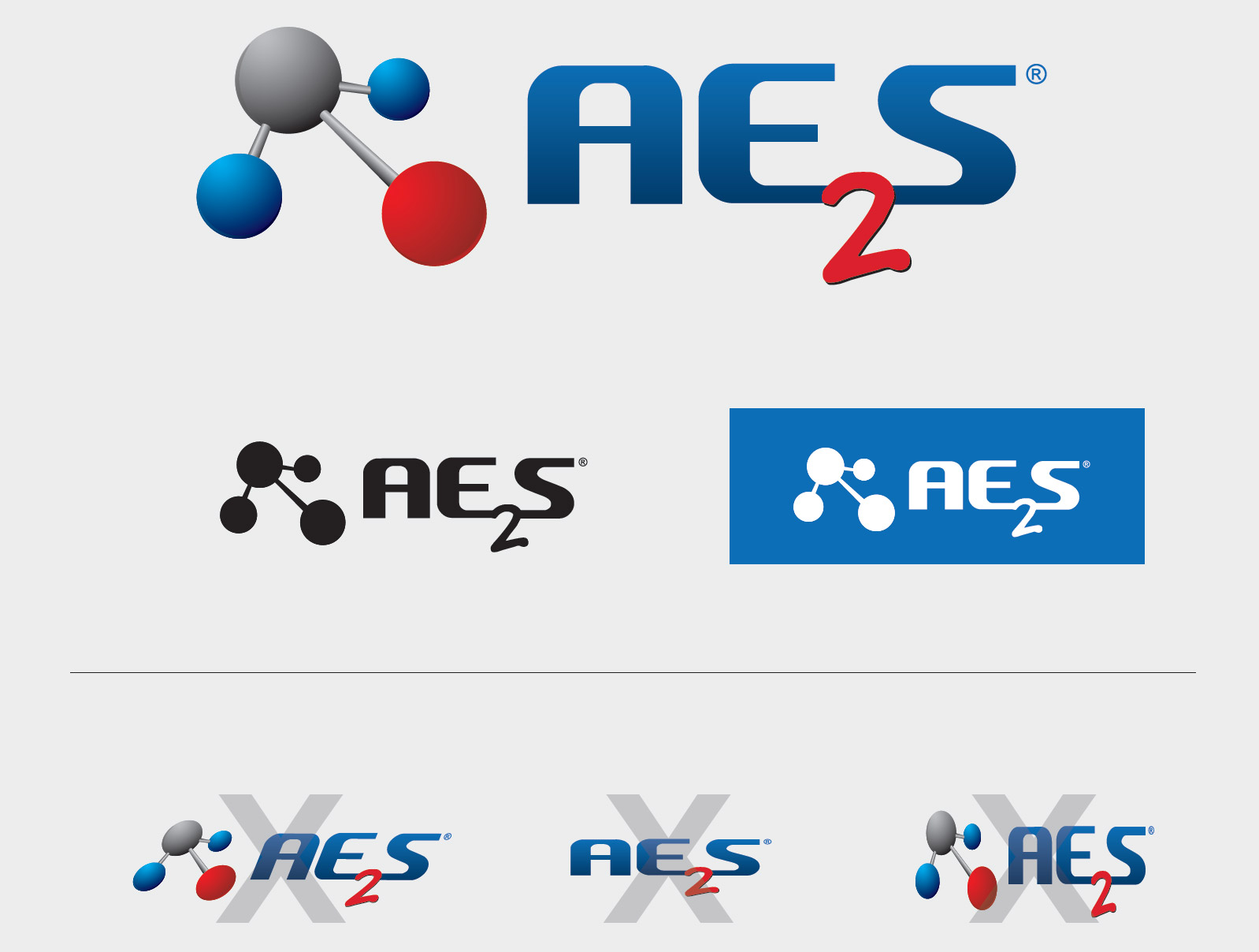
The AE2S logo was developed in the early 2000.  While colors and accents have evolved over the years, the molecule and subscript number ‘2’ have become iconic to AE2S. The molecule and subscript represent our character. This is the primary logo for AE2S and the foundation for all secondary logos. When possible, the use of the full color logo is preferred, but one color logo options can be used in certain instances.

SIZING GUIDELINES

Our logo plays a key role in how we brand ourselves, so understanding how to display it correctly is equally important. In terms of size, we recommend keeping the height between 0.25 inches and 0.5 inches.


THINK BIG. GO BEYOND.

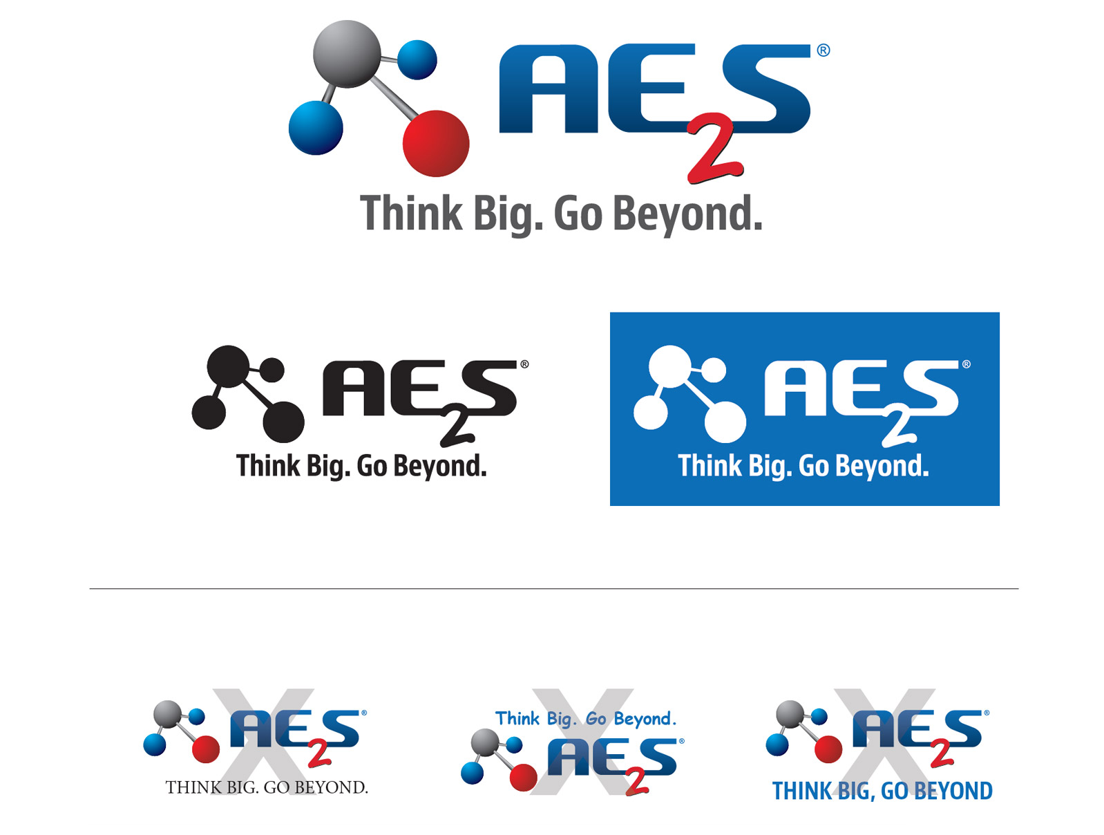
A tagline is important to a brand because it embodies the brand in just a few words. The tagline “Think Big. Go Beyond.” communicates AE2S’ passion for delivering tailored, innovative solutions and going beyond expectations. We harvest a culture of competition that empowers our team to reach beyond the standard way of doing things and truly deliver on everything we set our minds to. The use of the logo with the tagline should be used whenever targeting new audiences and when space permits.

blank
blank

MOLECULE

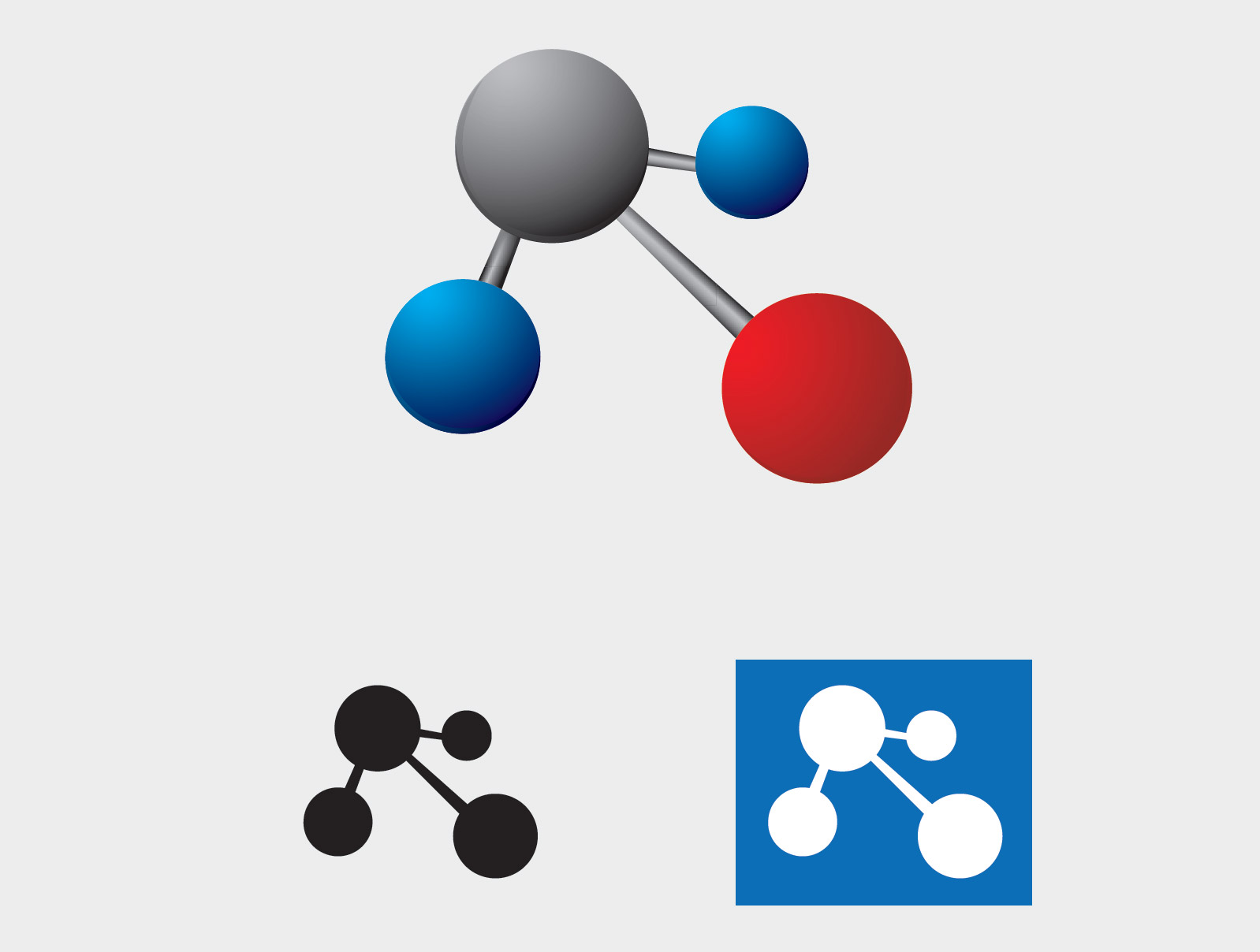
The molecule in the AE2S logo is the most iconic image of AE2S. In specific instances, just the molecule can be used to represent AE2S. However, this version of the logo should ONLY be used where the AE2S brand is well recognizable, or in conjunction with the primary logo.

PRIMARY COLORS

original BLUE
Pantone 281C
C=100 M=65 Y=0 K=64
R0 G32 B92
#00205c

original RED
Pantone 187C
C=0 M=82 Y=74 K=33
R172 G22 B44
#ac1f2d

PRIMARY BLUE
C=97 M=40 Y=0 K=28
R5 G110 B183
#056eb7

SECONDARY COLORS

LIGHT BLUE
C=21 M=0 Y=4 K=7
R187 G229 B238
#bbe5ee

GREEN
C=11 M=0 Y=74 K=21
R179 G201 B53
#b3c935

ORANGE
C=0 M=35 Y=86 K=5
R241 G157 B33
#f19d21

FONTS

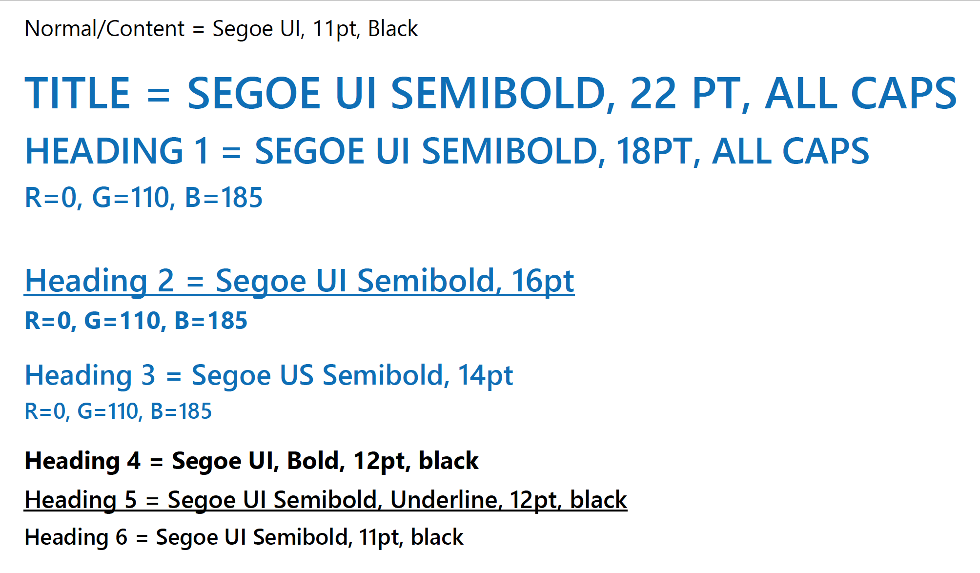
The use of typography distinct to AE2S’ brand is another way to keep the brand recognizable and distinguishable from others. For all technical documents including reports, addenda, and technical memoranda, SEGOE UI should be used in different weights and sizes. Segoe UI is a universal san serif font found on most devices. If your device does not have Segoe UI installed on it, please contact the IT Department.

blank
blank

WRITTEN AE2S

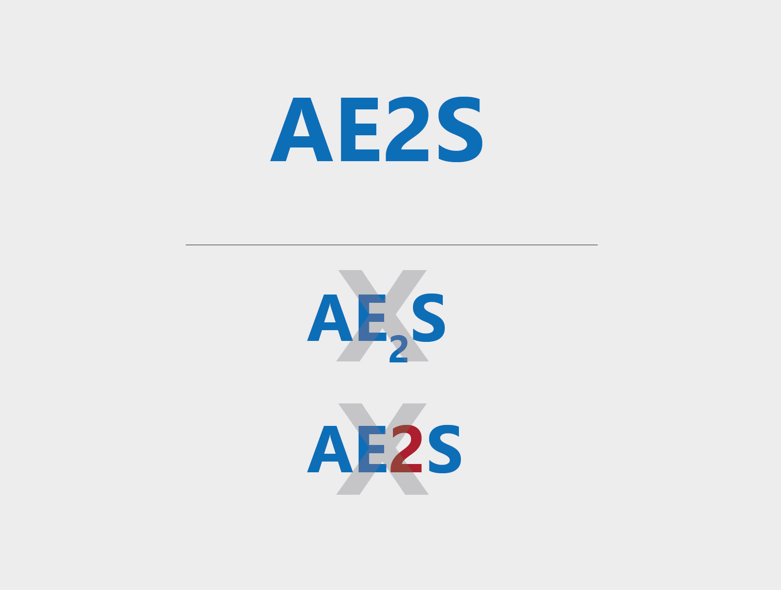
AE2S is the abbreviated version of Advanced Engineering and Environmental Services, LLC. The number two in the AE2S logo is representative of both the words ‘Engineering’ and ‘Environmental.’ The subscript is unique to the AE2S logo and brand. However, when using the abbreviated name in text form, all letters should be uppercase and the ‘2’ should always be in regular text line form. Subscript SHOULD NOT be used, except in the logo. In addition, all four letters of AE2S should be one color. The ‘2’ SHOULD NOT be a different color than the other letters.

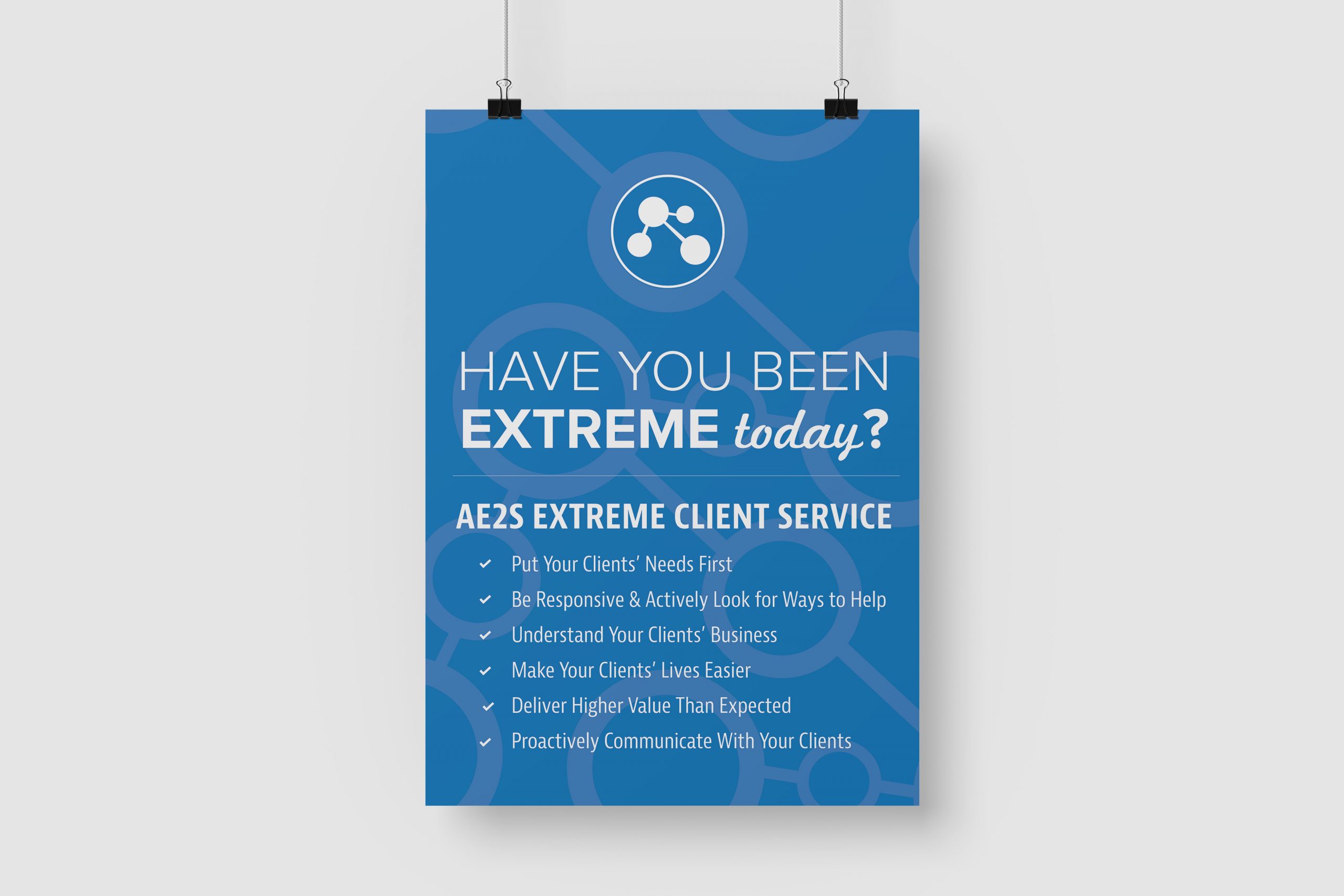
BRAND IN ACTION

BRAND RESOURCES

For ready-to-use templates, logos, and examples check out the Branding + Marketing section on Drop.

QUESTIONS?

Contact Sue Hass – Marketing Manager
Sue.Hass@ae2s.com