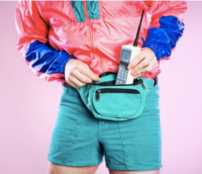
Do you recall the days where you would rock your acid washed jeans with a Hypercolor t-shirt and neon fanny pack? Or how about your perm plastered with a full can of aqua net and the smell of cucumber melon filling the air. Do you remember the moment you looked in the mirror and realized that these styles no longer fit you? Brands are no different. Over time, your city or utility’s brand may need to be refreshed. Here are six ways you can tell when it’s time for an updated brand:
1. Your Brand Doesn’t Differentiate. 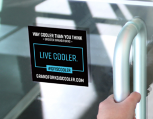
Is your City’s brand “Live. Work. Play.”? These three things are essential for attracting people to your City, but we ALL live, work, and play in the City we inhabit. A good brand is authentic to what makes your City unique. Take the #GFisCooler brand for example. The Grand Forks, North Dakota region, struggling to fill its workforce demand and goals, recognized the need to brand the region in order to attract people to the area. While the goal was to get people to live, work, and play in the area – the struggle was to convince people to do that in Grand Forks, rather than other regional options. It’s no secret that Grand Forks is cold. And for a long time, the region tried to disguise this fact. But in reality, the cold is what makes Grand Forks unique! On the coldest of days, residents take pride in the fact that they are hardy enough to live in one of the coldest parts of the country. And events and activities center on the cold winter climates, as well as the rest of the seasons.
Ultimately, the City has a lot of cool things to offer. This uniqueness is where #GFisCooler is rooted. It encompasses the people, place, and personality of the region. And since its implementation, the brand has been embraced by residents. While cold weather may seem like a weakness, the brand is successful because it is authentic. Everyone is going to live, work, and play somewhere, successful brands give them a reason for it to be in YOUR City.
2. Your Brand Doesn’t Represent Your Current Community Personality and Culture.
Finding a brand that is authentic to your City is not a new concept. In fact, many cities were branded to represent their unique character… decades ago. But today, that brand may no longer represent the City. Cities evolve over time as cultures, demographics, and industries change. What shaped your community 25 years ago, may not be the same today. Does your brand still resonate to your current residents? An important part of branding is what our team calls “discovery.” Discovery may include a community survey, focus groups, or small and large engagement opportunities. Maybe it’s time to ask your residents how they feel about your community to get a handle on whether your brand still resonates and reflects the current personality.
3. Your Brand No Longer Fits Your Mission and Vision.
Similar to the previous reason to rebrand, your brand should represent your long-term mission and vision for the City. Successful cities often invest a lot of time and money into long-term strategic planning. However, the resulting mission and goals for the City don’t always match the current brand of the City. As stated above, the most successful brands are a reflection of a City’s authentic self, not what it wishes to be. If your utility has a specific set of goals to reach, your brand must have the strength to chart the course of direction, support action plans, and those goals. If your City’s uniqueness is its ability to be a sophisticated shopping destination, your brand needs to represent that sophistication.
4. The Symbolism of Your Logo isn’t Clear.
While a brand is more than just a logo, your logo says a lot about your brand. Do you know what your logo says? Do you know what the colors and elements in your logo mean? Similar to discussion point #2, your logo may have been designed many decades ago. And over the years, with staff and resident turnover, knowledge of the meaning or theory behind your logo may have been lost. The City of Barron, Wisconsin found itself in this situation.
![]()
![]()
The logo had been used for many years, but no one knew where it came from or what the complex logo represented. Aside from the ‘B’ for Barron, the origin of the other elements were based on speculation. Was the feather a Native American reference? A specific animal? Or did it represent the JENNIE-O Turkey plant in town? AE2S Communications is helping the City of Barron rebrand itself with this updated logo to reflect the City’s strong values and culture.
5. Your Logo Doesn’t Work Well in All Media Forms.
Your logo should clearly represent your City and communicate its identity. A City or utility’s logo can be found on everything from stationery, website, clothing, signage, water towers, promotional items, vehicles, you name it! From a technical standpoint – your logo should be able to replicate (while still carrying your brand and messaging) on a variety of media formats. Too many colors drive up costs. Some images don’t reproduce well in large formats. Crazy fonts are hard to read from a distance. A variety of factors play a role in making logos visually, functionally, and cost effective.
6. Your Brand Simply Feels Outdated.
Has your logo just seen better days? Like your acid washed jeans, is the style just dated? Are you embarrassed to give your business card to a colleague? Is it getting harder and harder to design modern materials around a logo that just doesn’t work? It might be time for a rebrand. Or in some cases, maybe a brand refresh is an option. It’s no secret rebranding cost money and time – especially when you’re a community that has signage, vehicles, monuments, and water towers with your logo front and center. So, might your logo be salvageable with a few tweaks?
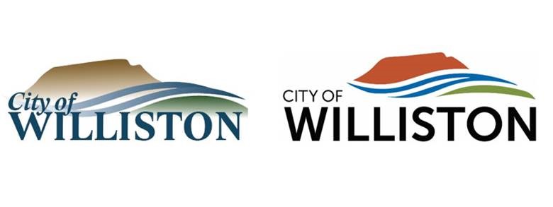
The City of Williston, North Dakota had a logo that represented the unique land and confluence of rivers that defines the community, but City leaders didn’t love how it looked. The original logo contained multiple fades and colors that were too close in tone to showcase the vibrancy of the area. Additionally, the font wasn’t as modern as they would have liked. Working with the City, AE2S Communications used photographs of the area to derive an authentic color palette and updated fonts to show a clean, modern version of the logo they truly identified with. The City has adopted it over time with brand consistency guides helping all departments move towards this look.
What does your logo say about your City or utility? Business in the front, party in the back? (If so, not judging, sort of impressed!) If it smells of the scent of cucumber melon or has the feel of your 80’s blowout, maybe it’s time for a new look! Contact Andrea Boe, AE2S Communications Practice Leader, to find out how to kick off the rebranding process.